Poor Pioneer Press. I mean, they’ve been through some major shake-ups in the past years. They’re a tiny, home town paper. They have less popular comics than their competitor. And they made the mistake of trying to woo us, die-hard Star Tribune readers, by sending us a free copy of their newspaper.
So it was that one Sunday morning I got up exceptionally early and realized that while my Star Tribune carrier was still happily slumbering, my dutiful free Pioneer Press carrier had already delivered the goods. And so this morning, I opened the Press and started reading.
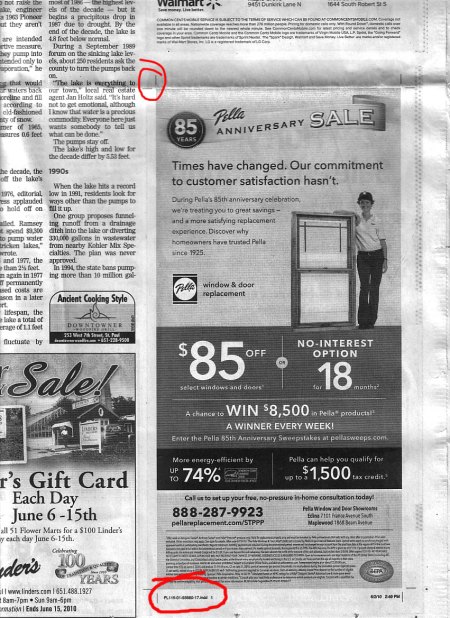
The article about White Bear Lake’s waxing and waning lake levels caught my eye. Following the breadcrumbs from the cover of the local section to page 3B to finish my article, I was greeted with a graphic designer’s nightmare! Surrounding what otherwise was quite an attractive and well-designed advertisement for Pella Windows, were…CROPMARKS! PAGE INFORMATION! GASP!
Ok, for those of you who are not design geeks like myself, here’s a little background info. Crop marks are little lines, placed at each corner of printed artwork, that tell the printer how to position, print, and trim the artwork. They are not intended to be seen in the final product. Page information tells the printer the name of the digital file, as well as the date and time the information was printed. Also not intended to be printed in the final piece.
I frequently include crop marks when submitting art to publications, so they know how to place the art within their design. These are particularly helpful if you’re submitting an advertisement intended to have a white border around the edge.
Ok, so here’s the mess itself:
Lest you think I’m a terrible nasty person for pointing this out, I’d like to point out that we all make mistakes from time to time (see my previous article about apologizing!), and in the world of newspaper publication—when turnaround times are quick—a mistake here and there is bound to happen.
And, little mistakes like these make great gems for educating design students about the print process. So thanks for that.
On the flip side, I’d hope that the Pioneer Press made concessions to the advertiser for their error, which clearly had a negative reflection on the advertisers’ brand. And, unfortunately, their mistake cast a poor light on their publication to me—their potential subscriber—when it mattered most.
The lesson here? Well, never skip the step of careful editing and proof reading when you are publishing something to be seen by your potential audiences. It’s that expression your mom loves to use: you never get a second chance to make a first impression.
